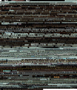
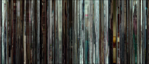
Manchester by the Sea is a beautiful and devastating story of a man and his nephew navigating the murky waters of grief and nostalgia. Set in small-town Massachusetts over a winter, the two main characters deal with the death of their loved one and the dark past that lies in the hometown. As would be expected with a dark drama, the director, Kenneth Lonergan, uses dark lighting and dim, muted colors throughout the movie. However, a pattern I noticed as I watched the movie was the reoccurrence of dark colors contrasted with light, pastel blues in the shots, often highlighted with natural lighting. Many times Lee, the uncle, would wear dark dingy clothes, and would be standing in front the bright blue Massachusetts ocean. To no surprise, the montage reflected this clearly. Stark lines of cool blue are interrupted by deep blacks; the color scheme conveying the same feelings Lee and Patrick felt after the death of their brother and father, respectively. These color choices helped to present the mood and emotions of the characters: reserved, cool, withdrawn, and depressed.
An interesting pattern I noticed was the lack of continuity in some sections of the montage. There are sections of blue-gray, then a block of pure black, only to continue the same color scheme right after. Upon closer inspection, I realized that was the part of the movie where Lee kept flashing back to a bad memory. While watching, the transition between past and present was rather smooth, and I didn’t notice the quick changes in color. The montage helped me realize how quickly Lee was shifting between bad memories from the past and the present, which gave more insight into the emotional strife of his character. This is a great example of how a montage can be useful to gain more insight into the movie’s message. In my case, it was helpful for broad generalizations about mood and small details about character traits. Also included below is the barcode that I generated as well. The themes permeated through this data visualization too.

